Your SaaS product didn’t lose that user after 30 days. You lost them in the first 600 seconds.
I’ve watched it happen dozens of times. Someone signs up—genuinely excited—clicks into the dashboard, and within minutes, their cursor starts drifting. They open a new tab. They check email. They never come back.
Most SaaS teams obsess over Month-2 churn analysis and quarterly retention curves. They build elaborate win-back email sequences for users who left weeks ago. But here’s the uncomfortable truth about SaaS onboarding problems: the decision to stay or leave almost always happens before a user finishes their first cup of coffee with your product.
By the end of this guide, you’ll understand exactly why users abandon SaaS products in the first 10 minutes—and what specific onboarding changes actually fix it.
What New Users Actually Experience After Signing Up
Let me walk you through what most SaaS signups feel like from the user’s side.
You enter your email. Confirm it. Set a password. You’re in. And then—
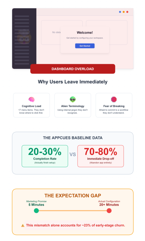
A dashboard. With seventeen menu items. Three notification banners. A settings gear icon. Some charts showing zero data. Maybe a welcome modal that says “Get started!” with no indication of how.
This is dashboard overload, and it’s the silent killer of SaaS user adoption.
The user doesn’t know where to click first. They see terminology they don’t recognize. They’re afraid that clicking the wrong thing will break something or commit them to a workflow they don’t understand.
So they do the most rational thing possible: they leave.
This pattern is especially brutal for complex tools—CRM platforms, analytics suites, project management systems. Anything where the feature visibility is low and the cognitive load is high.
Research from Appcues consistently shows that onboarding completion rates hover around 20-30% as a baseline. That means 70-80% of your signups aren’t even finishing the initial setup flow.
And the expectation gap makes it worse. Your marketing page promised a “5-minute setup.” The actual time-to-completion is 20 minutes of configuration. That mismatch alone accounts for roughly 23% of early-stage churn—more than pricing complaints, more than missing features.
The Three Biggest Reasons Users Leave in Under 10 Minutes
1. No Clear First Step
This one sounds almost too simple to be a real problem. It is. When a user lands in your product and there’s no obvious “do this first” signal, you’ve introduced setup abandonment risk from second one. Users who don’t complete a meaningful micro-conversion within the first few minutes are dramatically less likely to return. The data backs this up: setting alerts for “no core action by Day 3” is one of the earliest reliable churn predictors, but honestly, by Day 3, you’ve already lost the momentum. The fix isn’t a checklist sidebar. It’s a single, unmissable prompt that says: “Here’s the one thing to do right now.”
2. Too Many Features Visible at Once
I’ve seen products that expose their entire feature set on Day 1. Every button, every menu, every integration option—all visible to a user who signed up 45 seconds ago. Feature overload creates paralysis. It’s not that users don’t want powerful tools. They do. But showing everything upfront is like handing someone a 400-page manual when they asked for directions to the bathroom. The activation rate difference is staggering. Companies that redesign onboarding to progressively reveal features see activation jump from 15-25% to 40-60% within 60 days. That’s not a marginal improvement. That’s a fundamentally different business.
3. No Product Guidance Whatsoever
This is the one that frustrates me most. Many SaaS products essentially say: “Here’s the product. Figure it out.” No guided workflow. No contextual prompts. No indication of what “success” looks like inside the tool. Users are left to explore blindly, and blind exploration in unfamiliar software isn’t adventurous—it’s anxiety-inducing. The TTFV benchmark for B2B products is 10-15 minutes. Anything longer and completion rates collapse. But without guidance, most users can’t even find the core value action, let alone complete it.
📉 The Cognitive Overload Bailout
Recent 2026 UX behavioral studies reveal that if a new user is presented with more than 5 navigation options upon their first login, the probability of them taking zero actions and closing the tab increases by 44%. Simplifying the Day 1 dashboard to a single primary workflow is no longer just good design; it is a critical revenue retention lever.
Why Help Articles and Tooltips Don’t Actually Solve This
Here’s where a lot of SaaS teams go wrong. They recognize the onboarding problem, so they throw documentation at it.
Knowledge bases. Tooltip tours. Video libraries. FAQ pages.
Users don’t read documentation during their first session. They just don’t. Tooltips are too small, too generic, and too easy to dismiss. A tiny bubble saying “This is where you manage contacts” doesn’t help someone who doesn’t yet understand why they’d manage contacts in this particular way.
And help articles require the user to leave the product, search for their specific question, read a wall of text, then come back and try to apply what they read. That’s three context switches. Each one is an exit opportunity.
The core issue: users need to see the workflow in action, not read about it. There’s a massive difference between explaining a process and showing someone how it feels to complete that process.
When Complex Software Meets Non-Expert Users
This problem intensifies dramatically in specialized domains.
Consider accounting platforms like ProfitBooks. For small business owners who aren’t finance experts, tasks like setting up GST, creating invoices, or interpreting financial reports can feel genuinely intimidating without clear guidance inside the product.
The terminology alone—ledgers, reconciliation, tax compliance—creates an immediate barrier.
And this isn’t unique to accounting. Any SaaS product that serves users outside its core domain faces the same challenge. A marketing automation tool used by a solo founder. An analytics platform adopted by a content team. A project management suite rolled out to a creative agency.
The expectation gap is widest here. These users signed up because your marketing spoke their language. Then the product spoke a completely different one. Martech products, for instance, have a structural retention problem—Month-1 retention sits at just 44.7%, with a TTFV of nearly 1 day and 20 hours.
That’s more than 8 hours longer than the SaaS average. The result? A 55.3% Month-1 abandonment rate.
When your users aren’t domain experts, every piece of unfamiliar jargon, every unexplained workflow, every ambiguous button label becomes a churn signal.
Accounting doesn’t have to be a barrier.
Small business owners shouldn’t need a finance degree to run their company. ProfitBooks strips away the complex jargon, making it incredibly simple to create GST invoices, manage inventory, and track expenses without the steep learning curve.
What Actually Keeps Users Engaged in the First 10 Minutes
So what works? After watching cohort analysis data across multiple onboarding redesigns, a few patterns are consistently clear.
- Guided walkthroughs that force a single meaningful action. Not optional checklists—those have a 12.5% completion rate in some categories. I mean a mandatory micro-action that gets the user to their aha moment. Slack nails this: your first action is sending a message. That’s real value in under 5 minutes.
- Progressive feature disclosure. Show three things on Day 1. Reveal more as the user demonstrates readiness. This respects the user’s cognitive load and keeps feature visibility aligned with their actual competence.
- Contextual learning, not front-loaded education. Teach users when they need to know something, not before. If someone clicks “Create Invoice,” that’s when you explain invoice fields—not during a 15-minute onboarding tour they’ll forget immediately.
- Showing actions instead of explaining them. This is the big one. When users can see what a completed workflow looks like—when they can interact with it rather than imagine it—activation rates climb significantly.
Companies targeting sub-5-minute TTFV consistently hit 60%+ activation rates when the onboarding is interaction-based rather than instruction-based.
The verification check here is straightforward: create a fresh account yourself and attempt to complete the core value action. If you can’t do it in under 10 minutes without any prior knowledge, neither can your users.
Why Interactive Demos Improve Early User Engagement
This is where the SaaS demo strategy conversation intersects with SaaS product onboarding in a way most teams overlook.
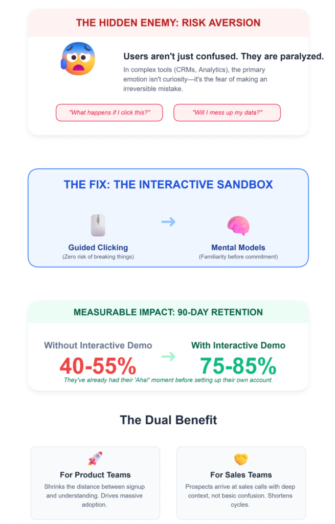
Interactive demos solve a specific problem: they let users experience the product workflow before committing to the full learning curve. Instead of reading about what a tool does, users click through it. They see the screens. They follow the steps.
They build mental models of how the product works—without the fear of breaking anything or making irreversible mistakes.
That fear piece matters more than most product teams realize. New users in complex software are often paralyzed not by confusion alone, but by risk aversion. “What happens if I click this?” “Will I mess up my data?” “Can I undo this?”
Interactive demos eliminate that friction entirely.
The impact on retention curves is measurable. When users arrive at the actual product with a pre-built understanding of the core workflow, 90-day retention can jump from 40-55% to 75-85%. They’ve already had their aha moment. The product feels familiar before they’ve even started.
Tools like LevelUp Demo help SaaS teams build these guided product experiences—step-by-step interactive walkthroughs that users can explore at their own pace.
The concept is simple: reduce the distance between signup and understanding. When that distance shrinks, adoption increases.
This approach is especially powerful for teams working on improving demo conversion rates, because the same interactive experience that improves onboarding also shortens sales cycles. A prospect who’s already clicked through your product workflow arrives at the sales conversation with context, not confusion.
⚡ Compressing Time-To-First-Value (TTFV)
SaaS companies utilizing interactive pre-signup product tours are seeing a massive shift in their onboarding metrics. Because the user is already educated on the UI before they even create an account, post-signup TTFV drops by an average of 58%. You aren’t just teaching them faster; you’re teaching them before the timer even starts.
The Troubleshooting Reality: What Goes Wrong Even When You Try
Problem: Users skip onboarding entirely
The Fix: Force a mandatory micro-action before granting dashboard access.
Why it works: Familiar UI creates false confidence; a forced action anchors the user in the workflow immediately.
Problem: Onboarding completion doesn’t equal activation
The Fix: Track completion AND activation as completely separate metrics.
Why it works: Martech shows 12.5% checklist completion but 24% activation—the gap reveals where the real drop-off lives.
Problem: Personalized flows are too expensive to build
The Fix: Segment by signup intent (2-3 personas max), not complex demographics.
Why it works: Generic flows: 12.5% completion. Personalized flows: 50%+. Even rough segmentation helps dramatically.
Problem: Risk scoring thresholds feel arbitrary
The Fix: Intervene between score 50-75, not at 90.
Why it works: By score 90, the user is already gone. The 30-day window is your last real chance.
Frequently Asked Questions
How long should SaaS onboarding take for B2B products?
B2B onboarding should target 10-15 minutes for time-to-completion. Anything longer causes steep drop-offs in completion rates. Focus on getting users to one meaningful action—not covering every feature. The goal is reaching the aha moment, not delivering a product tour. Benchmark against 65-85% completion rates for a well-designed flow.
Why do users abandon SaaS products even after completing onboarding?
Completing onboarding doesn’t guarantee activation. Many users finish checklists without performing the core value action that proves the product works for them. Track activation rate separately from completion rate. If there’s a gap, your onboarding is teaching mechanics without delivering value. Redesign around business outcomes, not feature walkthroughs.
What is the most effective SaaS onboarding strategy for reducing early churn?
Compress your TTFV to under 5 minutes for consumer products and under 15 minutes for B2B. Force one meaningful micro-conversion early. Audit your marketing against actual setup time to close the expectation gap. Teams focused on how to convert more demos into deals find that the same clarity principles apply to both sales and onboarding.
Do interactive demos really improve SaaS user adoption?
Yes. According to Wyzowl’s research, interactive product experiences significantly increase user understanding and purchase confidence. Users who engage with interactive demos build mental models of the product before using it, which reduces setup abandonment and accelerates activation. The effect compounds—users who understand the product faster retain longer.
The Clarity Problem No One Wants to Admit
Users don’t abandon SaaS products because of missing features.
They abandon them because they can’t quickly understand how the product works.
That’s it. That’s the whole thing. Every dashboard redesign, every onboarding checklist, every tooltip tour—they’re all attempts to solve this one underlying problem. And the teams that solve it directly, by making the product understandable in the first 10 minutes, are the ones watching their activation rates climb from 25% to 55% while their competitors are still writing help articles nobody reads.
The question isn’t whether your product has enough features. It’s whether a new user can figure out what to do with them before their attention moves somewhere else.
Build Clarity Into Your Product Experience
If your team is rethinking how users experience your product for the first time, LevelUp Demo helps SaaS companies create interactive walkthroughs that bridge the gap between signup and understanding—so users reach value faster.
✅ Reduce Onboarding Friction
✅ Compress TTFV
✅ Increase Activation Rates